Context
Project Context
The product was being re-launched and this meant an opportunity to uplift the origination (sales) funnel for both customer good and increased sales.
What is Home Loan Protection (HLP)?
Home loan protection is an insurance product that is effectively a life insurance and income protection combination. However, only CommBank home loan customers are able to apply for it. A short explanation of it is in the video below:
Problem Space
Like most insurance products, HLP was complex in construction and difficult to comprehend for average customers. This meant that:
- Customers may purchase suboptimal insurance cover that doesn't suit their needs
- Incorrect insurance cover leads to poor outcomes later when customers make claims (the time they need it most)
- Poor outcomes results in a terrible customer experience, brand damage and potential legal and regulatory ramifications for the bank
Hypothesis
If customers are able to better understand how insurance works they'll be more likely to choose cover that suits them. This will increasing overall sales and positive customer outcomes.
What I did
Collaborative design
I worked alongside a Design Lead, our product stakeholders and our scrum team to design, test and iterate on changes to the origination flow.
Together we agreed on key UX principles that would guide us throughout the project:
- Genuine intent to the do right thing for the customer
- Design for customer comprehension so they can make informed decisions
- Align designs to current CommBank typeform patterns
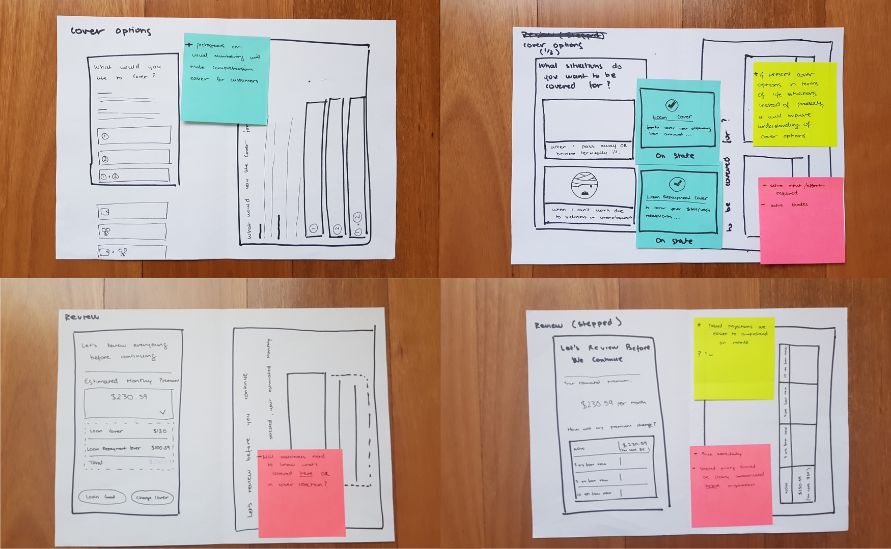
Sketching and iteration
After reviewing the existing flow, reading internal research papers and speaking to stakeholders, my first step was to begin sketching ideas on paper without constraints. This helped expand our thinking before inevitable discussions about feasibility. It also helped us ensure we didn't neglect responsive design. A couple of examples pictured below:
Prototyping & usability testing
As we continued to gain clarity on the project, I began prototyping and testing designs solutions. In total I tested and iterated my designs across 3 cadence sessions (15 participants total). A summary of key design decisions that were made are below:
Design Rationale
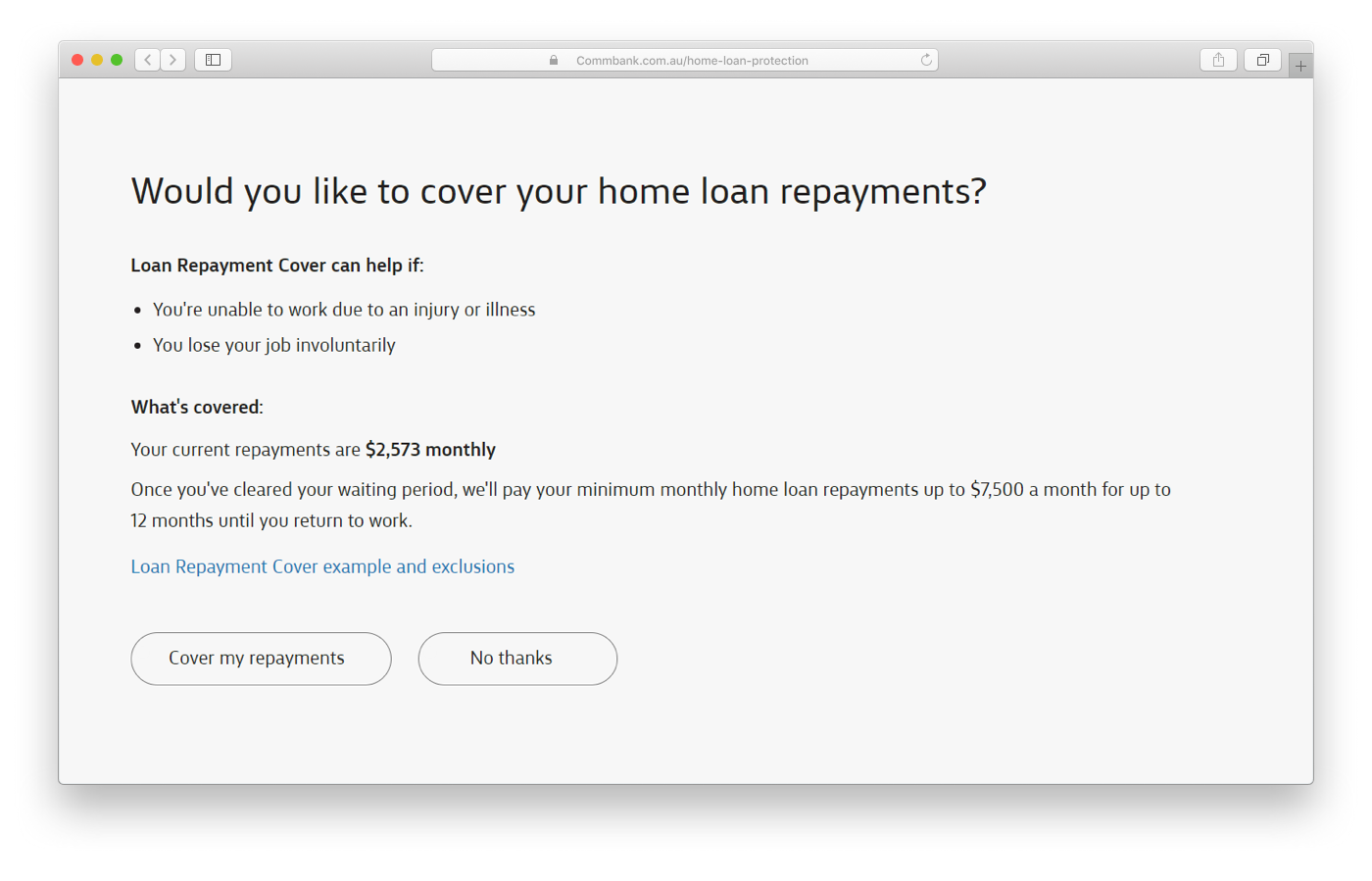
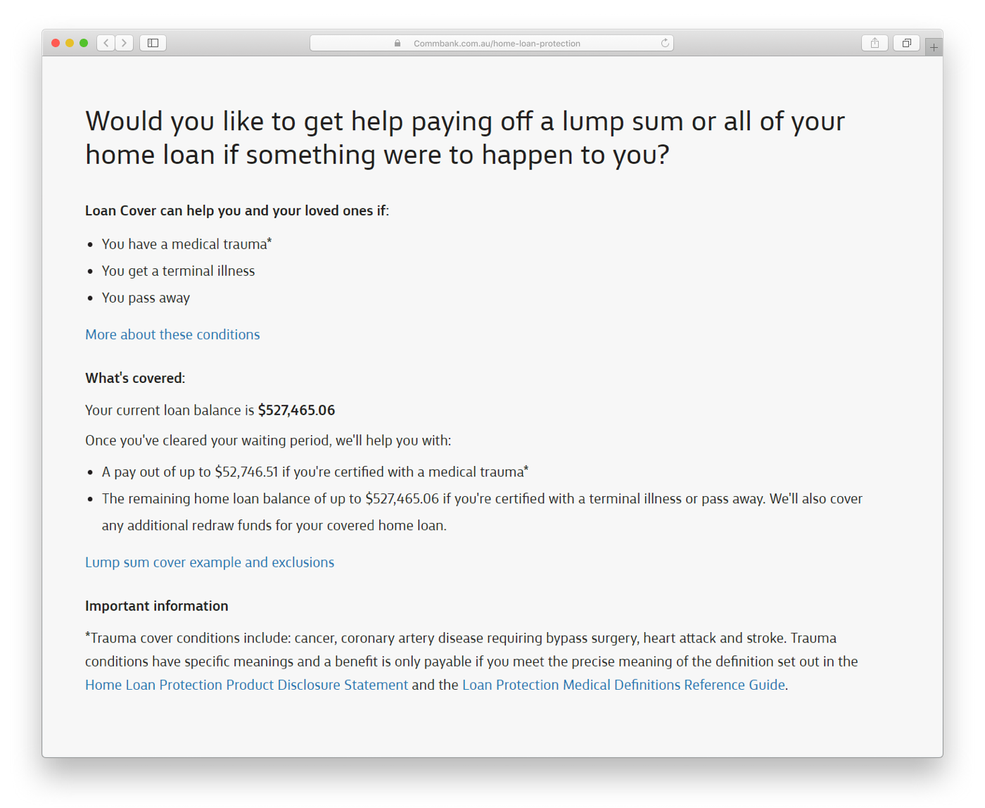
Help customers understand what they're buying
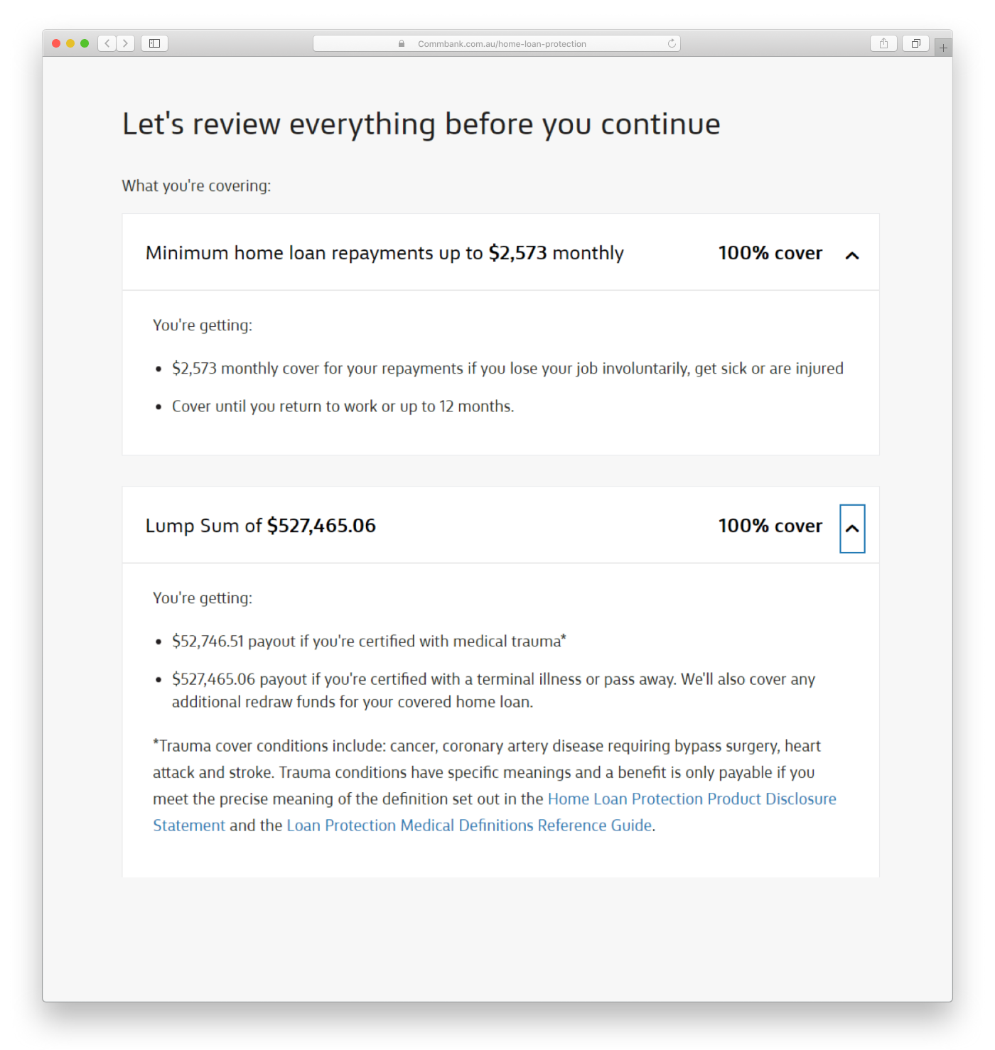
A typical origination funnel would prioritise a short length and speed. However, I took a deliberate approach to educate customers even if it meant a longer form. I included contextual product information that showed how the cover would work specifically for their home loan and unique situation. This data isn't available until a customer has logged in and therefore isn't typically shown on the product page. This is the first opportunity for customers to understand the tangible impact of their purchase.
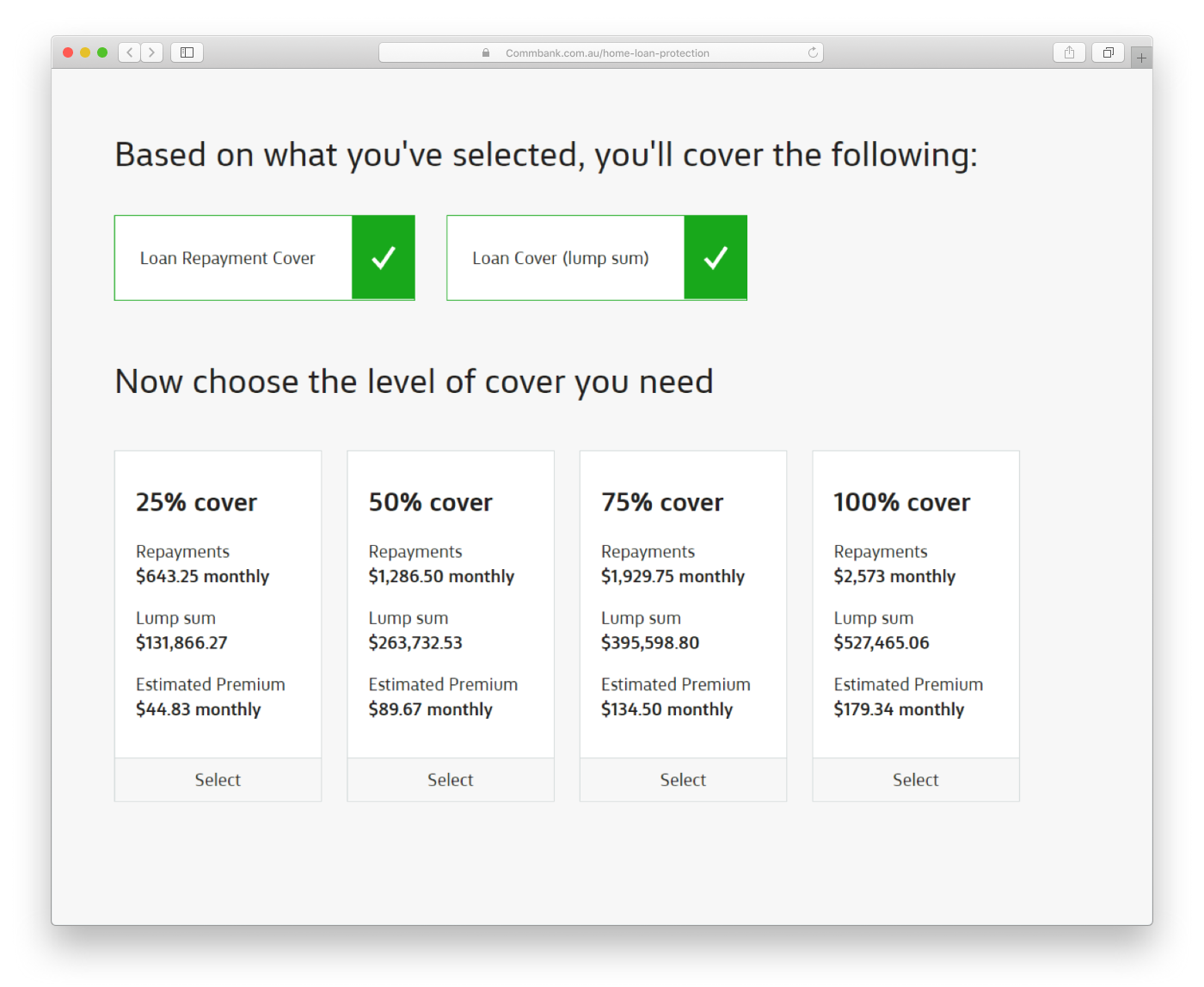
Help customers purchase the right level of cover
After dealing with the complexity of which cover, customers are prompted to choose what % of their home loan and/or repayments to cover. Again, playing back their actual amounts helps provide context for the impact that their decison will make. The two green tick tiles at the top were included as reminders.
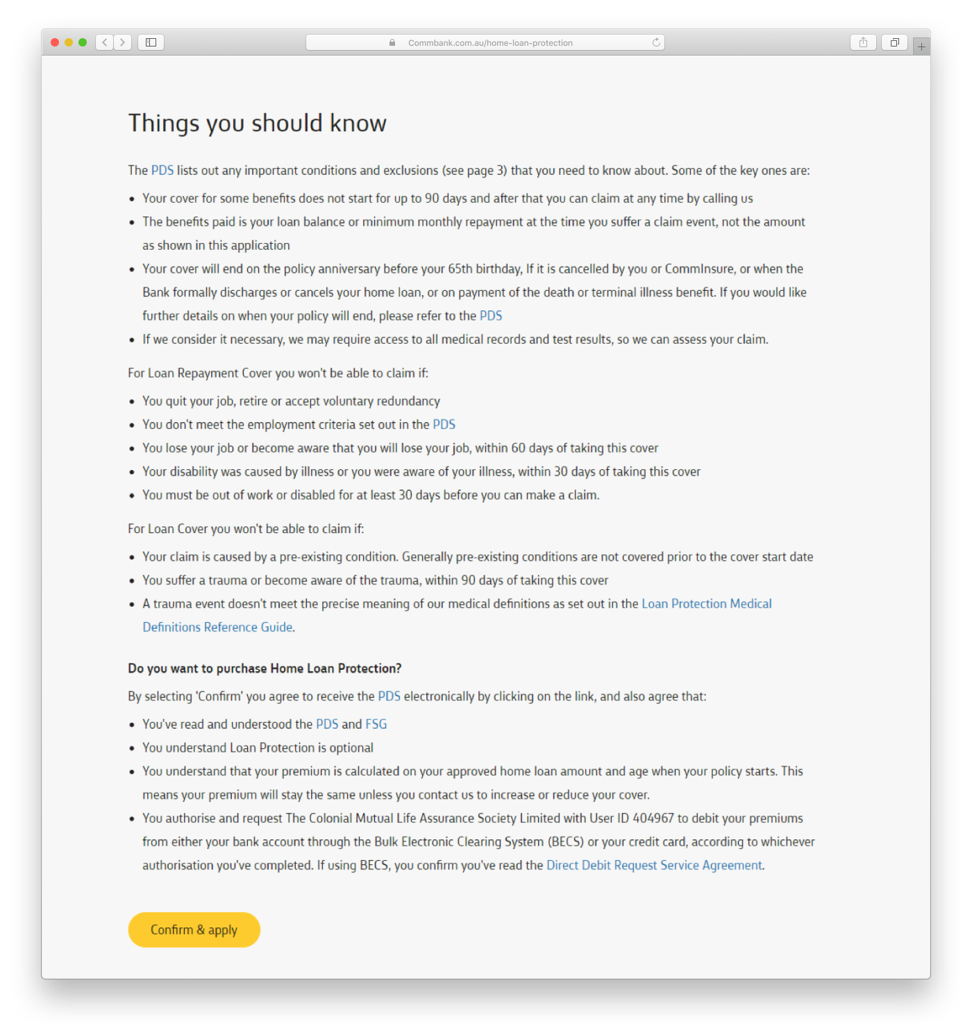
Be transparent and supportive
At the time I was working on this project, Australian banks were receiving negative press about prioritising profits over customers. So to fulfil our goal of "genuine intent to the do right thing for the customer" the designs were as transparent and supportive as possible. This meant, being transparent and clear at multiple points in the form about what the customer is purchasing:
Dealing with Constraints
Constantly changing product
The business were unsure of how the product should be constructed. There was lingering uncertainty about how the different covers would work. So I prioritised what was known and confident so that the scrum team could do the same and not waste time.
Compliance bloat
The legal and compliance obligations surrounding the product were immense. This meant dense copy had to be included in various parts of the form. Although it's important the bank presents T&C's, it can often be lengthy and customers skip them without reading due to learned behaviour across the internet. Including them involved a compromise between myself and the compliance team, but I made sure it had a hierarchy so that scanning was easier.
Outcomes
Through 3 rounds of user testing, our project team gained confidence that customers would adequately informed in the flow to make an informed purchase decision. By the last iteration, customers understood and could articulate the product, it's conditions and financial impacts even though they were unfamiliar with it at the start of the hour. 👍 👍 👍
Learnings
Although the insurance cover would provide piece of mind, it was inherently too complex. I sought to champion the customer and improve comprehension, but there was a limit to how much I could do. I learnt that:
- I should have drawn attention earlier on changing the product and not just how we sell it
- I should have presented product simplification ideas earlier or alongside designs
- A story weaved into my presentations would've made the problem space clearer for stakeholders